Anna Fleuri Wolters
Hidden Agenda Monthly: Edition #2 - March 2026
By Patou J. Foetisch // 21 JUL 2026
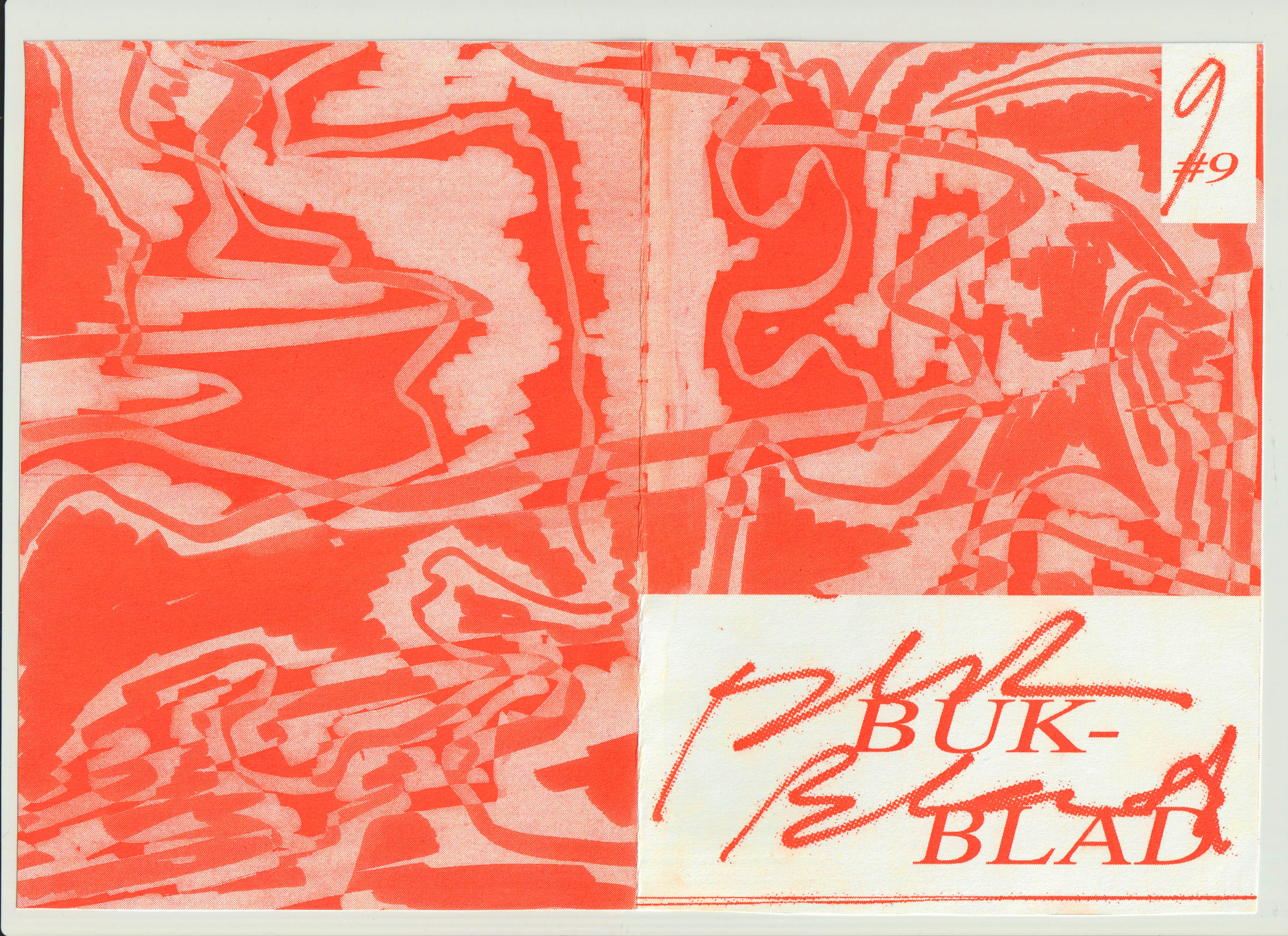
Image: Magazine cover for music magazine Bukblad
Some may know Anna Fleuri Wolters through sound, as the drummer of Housepainters or from Beatrix, others through images, posters and printed matter signed under her own name or the Scania moniker. All of her work circulates through the same spaces it grows out of: the speakers of small venues and, often simultaneously, their walls layered with gig posters across the Benelux. If you move within these circuits, you have likely crossed it. Having moved to Brussels in September in search of a breath of fresh air, her days are currently filled with overlapping commitments: new solo music, a project with her partner, a master’s programme in art and long hours of screen printing. “I’m a bit full with work,” she says, “but it’s really nice and exciting.” These pursuits operate like a collage, distinct in form yet subtly interconnected, each feeding into the others as a way of sustaining momentum and inspiration. Although she began as an illustrator, her practice has since been drawn outward into multiple disciplines, pulling visual work, music and writing into the same orbit, where rhythm and repetition move fluidly between media. Regardless of formats and contexts, her work maintains a consistent internal logic: clarity is not pursued in advance but emerges through careful assembly.
Concert poster for Claw Boys Claw in Paradiso Amsterdam
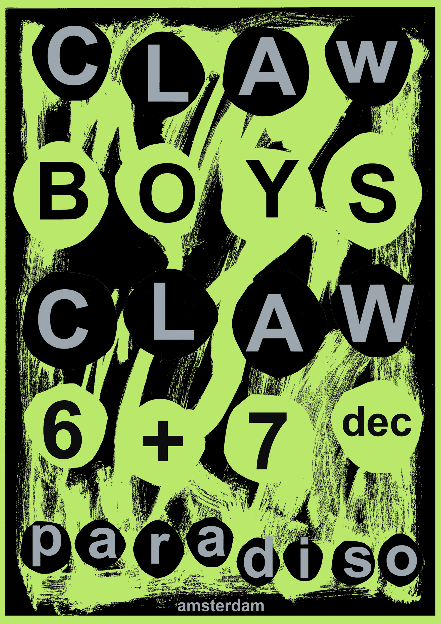
Wolters’ graphic work resists easy categorisation. Meaning is not produced through emphasis or excess but through attention to how elements relate to one another and how little is needed for an image to hold. Her approach is process-led rather than outcome-driven. Projects often begin without a fixed visual goal, developing instead through trial and response. “I don’t really know what something is going to be at the start,” she says. “It’s more about seeing what happens when things are put next to each other.”
Concert poster for Errerbergen in Le Sonic, Lyon
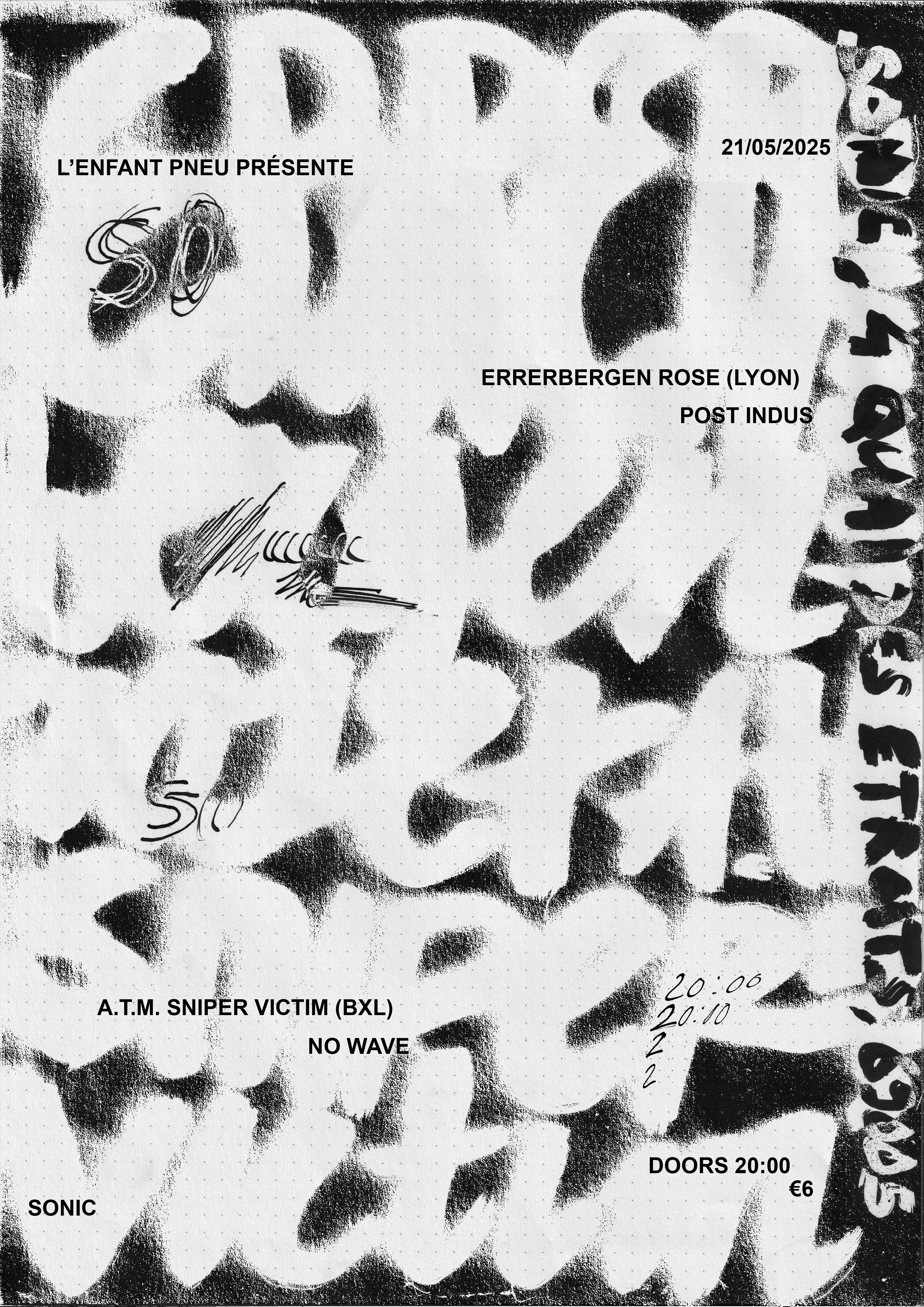
Influence, for Wolters, is rooted in proximity rather than distant reference. Within her local scene, comprising gig spaces, independent designers and print culture, inspiration moves through everyday exchange. “A lot of my inspiration comes from what’s around me, self-published zines, gig posters, records I find in thrift stores. And for music, it’s definitely live shows. Seeing people play live is one of the biggest inspirations for me. It is this sense of closeness and participation that continues to shape my practice,” she notes, pointing to an understanding of art as something shared, accessible and made from within a community.
Housepainters album artwork
Typography plays a central role in her practice, though her relationship to it has shifted over time. “In the beginning, it was always a bit of a problem for me,” she admits. “I had some fonts that I liked, but why I liked them, I couldn’t really know.” How typography functions, however, depends strongly on format. “Especially with a poster, I zoom really out,” she says. “If someone sees this from far away, what actually stays?” She finds herself increasingly interested in the space between readability and interruption. “It has to communicate something,” she explains, “but do you immediately need to be able to read what it is? Or is it also striking to have a moment where you’re like, what does it say?” That brief hesitation becomes a way of holding attention, encouraging the viewer to look longer rather than consume the message instantly.
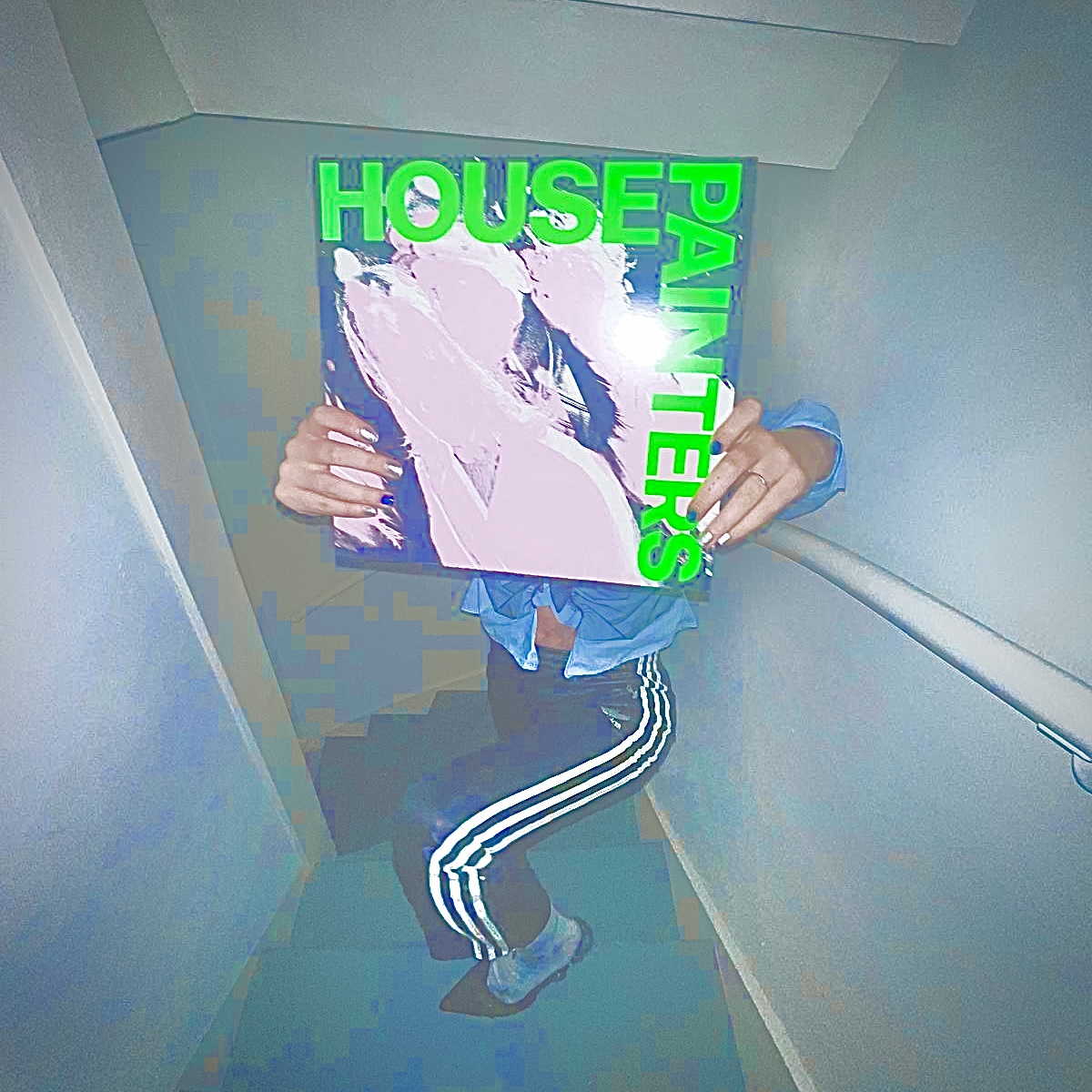
This shift is visible in projects such as the Housepainters LP artwork, where bold typography becomes structural rather than decorative. The band name is not relegated to a corner but integrated into the composition itself, combined with distorted photography, cut and rearranged figures, and heavy type influenced loosely by no wave aesthetics. Colour plays an equally decisive role. “I just really wanted to use neon green one time,” she says. Her
attraction to neon tones stems partly from frustration with the limitations of standard CMYK printing. Working increasingly with screen printing, where fluorescent inks are available, has opened up a palette that feels less restricted and more physical.
More Editorials
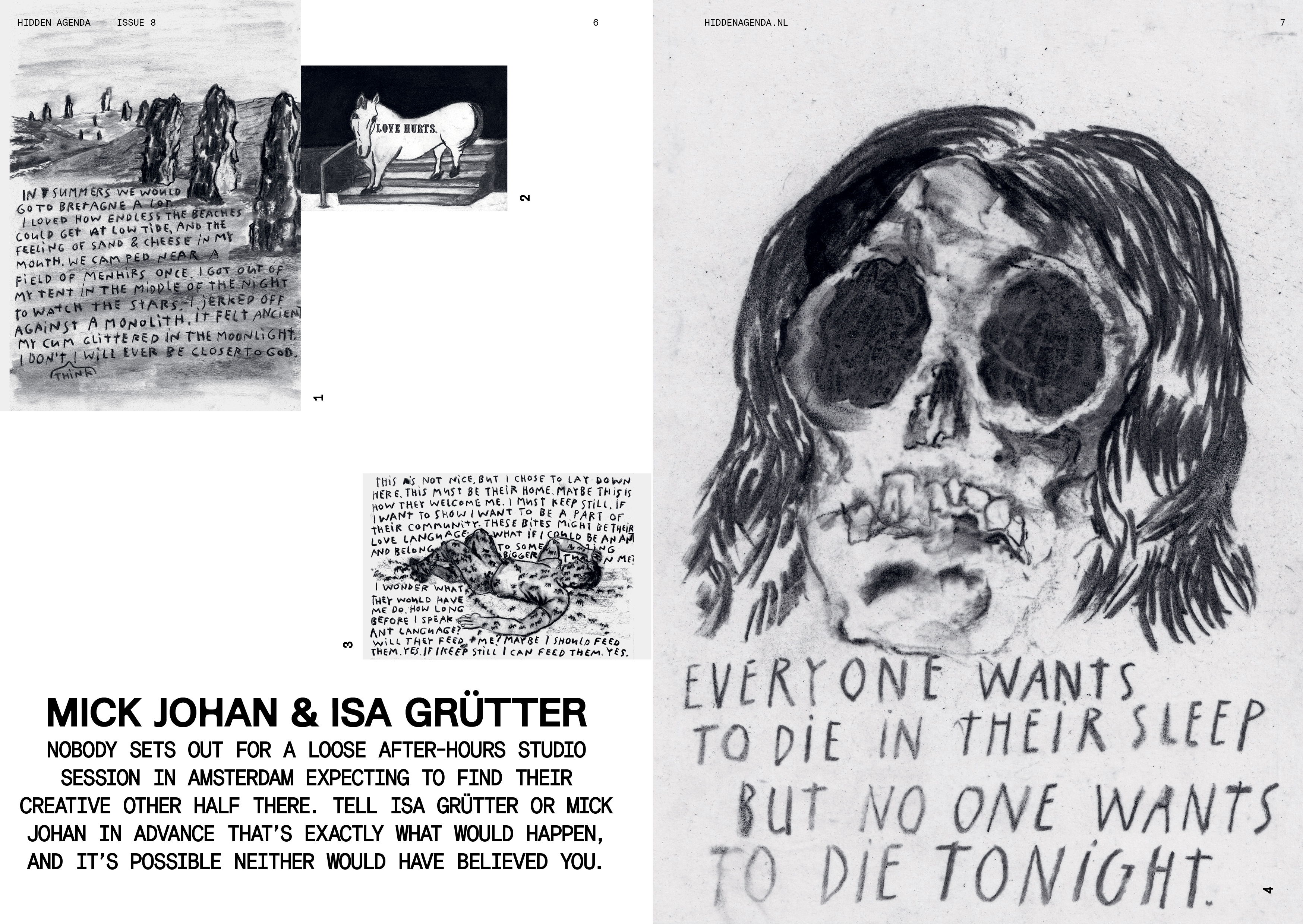
Mick Johan & Isa Grütter
By Patou J. FoetischNobody sets out for a loose after-hours studio session in Amsterdam expecting to find their creative other half there. Tell Isa Grütter or Mick Johan in advance that’s exactly what would happen, and…
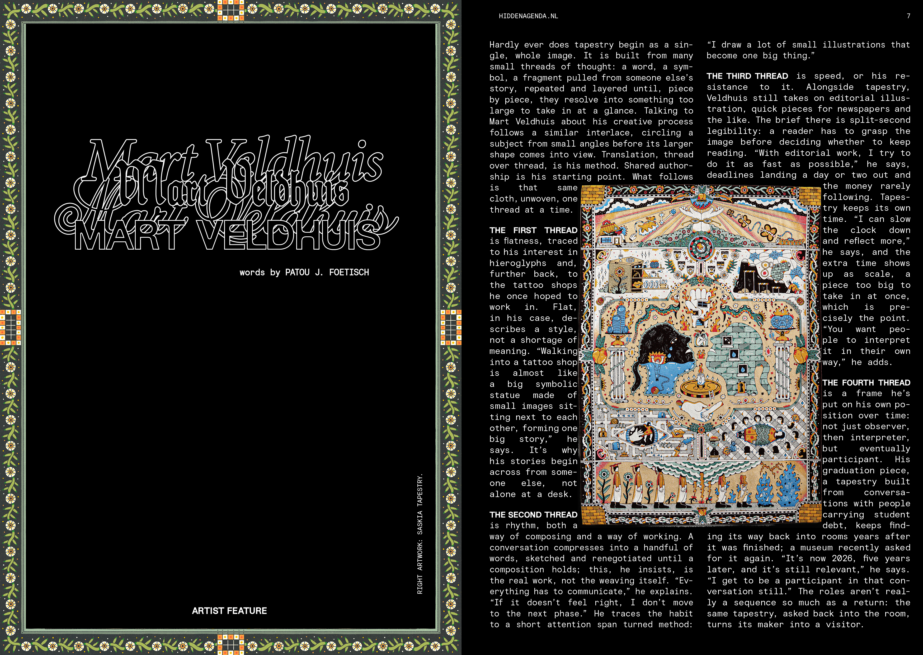
Mart Veldhuis
By Patou J. FoetischHardly ever does tapestry begin as a single, whole image. It is built from many small threads of thought: a word, a symbol, a fragment pulled from someone else's story, repeated and layered until,…
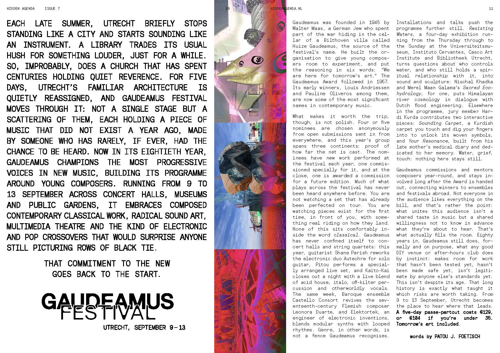
Gaudeamus Festival 2026
By Patou J. FoetischEach late summer, Utrecht briefly stops standing like a city and starts sounding like an instrument. A library trades its usual hush for something louder, just for a while. So, improbably, does a…
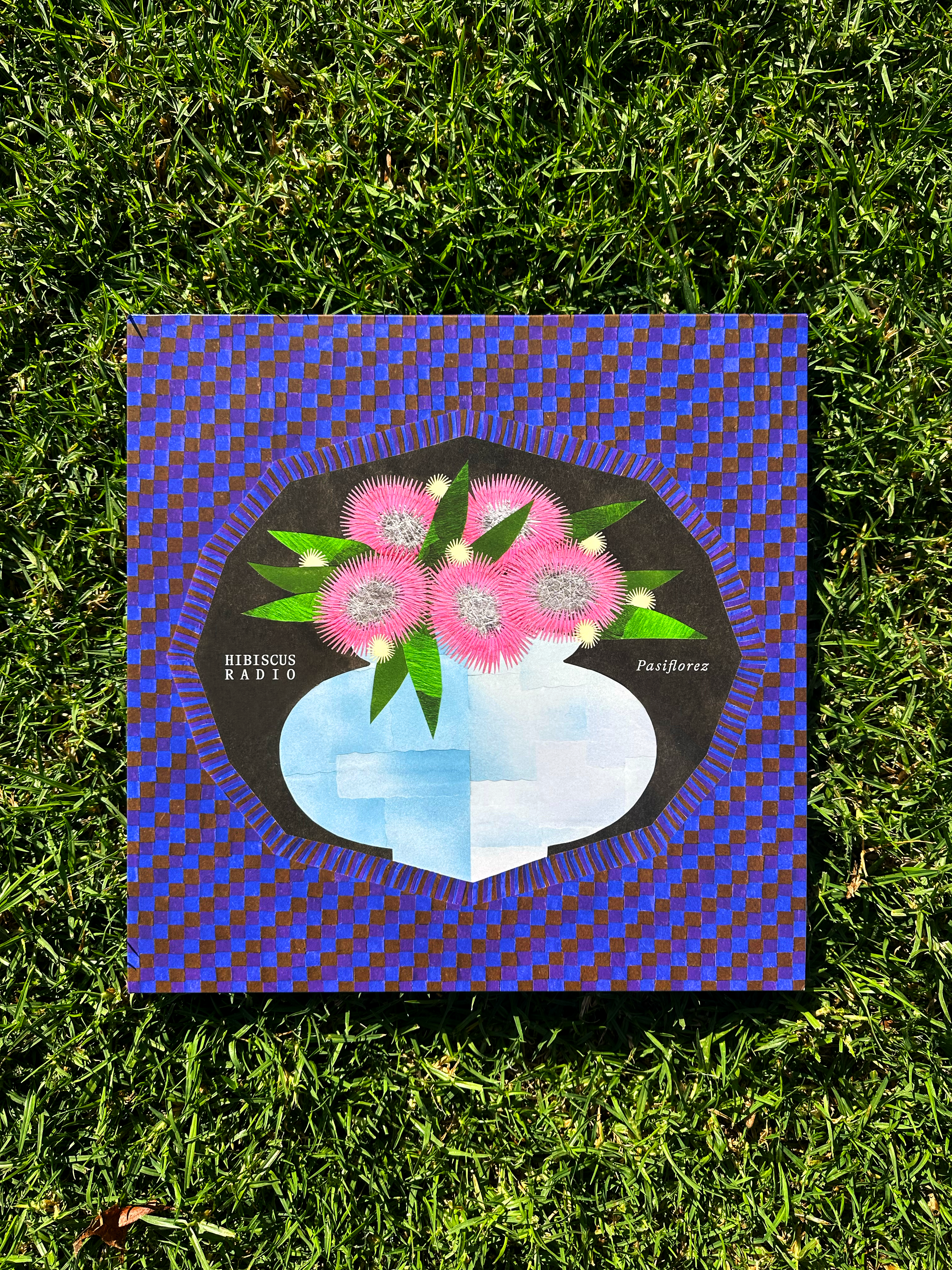
Juna Horstmans
By Patou J. FoetischJuna Horstmans' work often feels suspended between two recurring forms: the window and the flower. One frames perception, offering a partial view into something beyond itself; the other unfolds…
Meet your new favourite small-town punk
By Julia de Oliveira MoritzHere’s what it’s like chatting with Evan: he is almost perpetually excited, and the main way to tell if he’s smiling is through the slight movement of his moustache, unless he lets out his hearty…
Marieke Druiven
By Patou J. FoetischMarieke Druiven's work feels suspended somewhere between the familiar and the unreal. Her figures and environments carry the strange familiarity of something half-recognised, as though ordinary…
The cultural hangover following the Spotify boycotts
By Julia de Oliveira MoritzSpotify has faced criticism before. Taylor Swift, Joni Mitchell, and Thom Yorke have all removed their music from the platform in the past, only to sneak back in. It’s happening again now, seemingly…
Una Jongenelis
By Patou J. FoetischNot everything moves in a straight line. Some processes unfold through hesitation and repetition that are never quite the same. What first may appear as a digression begins to fall into its own…
Strip Fest 2026
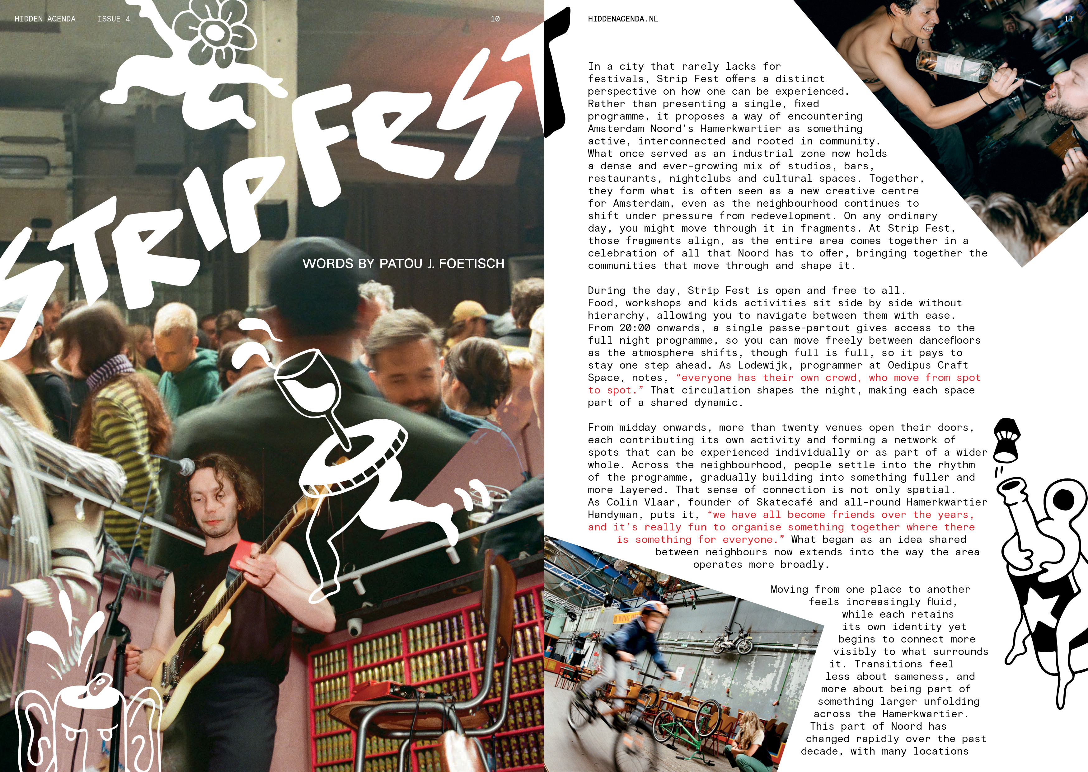
By Patou J. FoetischIn a city that rarely lacks for festivals, Strip Fest offers a distinct perspective on how one can be experienced. Rather than presenting a single, fixed programme, it proposes a way of encountering…
Hope Lives Next Door
By Bandgurl666Hope is never far away. She’s lurking around corners, hiding under bedsheets, tucked away in closets. We just missed her, she just left. But that’s okay, because we know she’s there. Do you know…